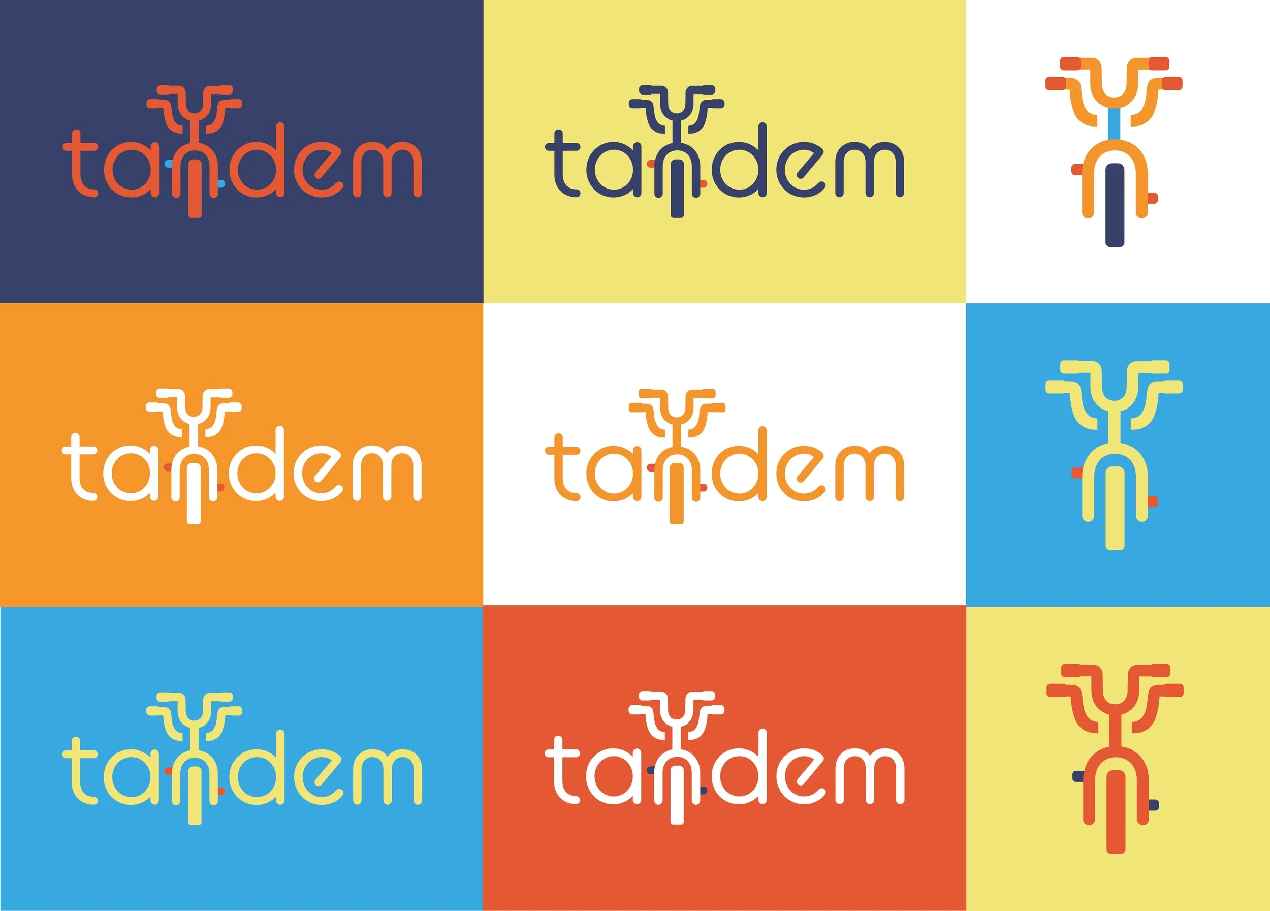
Tandem Logo Design
Student Gold ADDY Award Winning Logo Design created for my marketing team while working for MOJO AD Agency.
I served as Graphic Designer tasked with creating an embodied team brand, identity and logo.
“Tandem means alongside each other or together. A tandem bicycle is a machine so uniquely collaborative in its purpose, as it is only functional with the help of another. Our logo combines collaboration, youthfulness and teamwork into a modern yet playful design, showcasing a tandem bicycle as it progresses forward.” Copywriting by Sarah Tierney
Ace Logo Design
I served as Art Director and Designer with MOJO AD Agency tasked with creating an embodied team brand, identity and logo. As an all female group, we wanted a name and brand that was boldly feminine, yet strong like the Ace. The varied suits represent the diversity of our team, that all plays together to win the game.

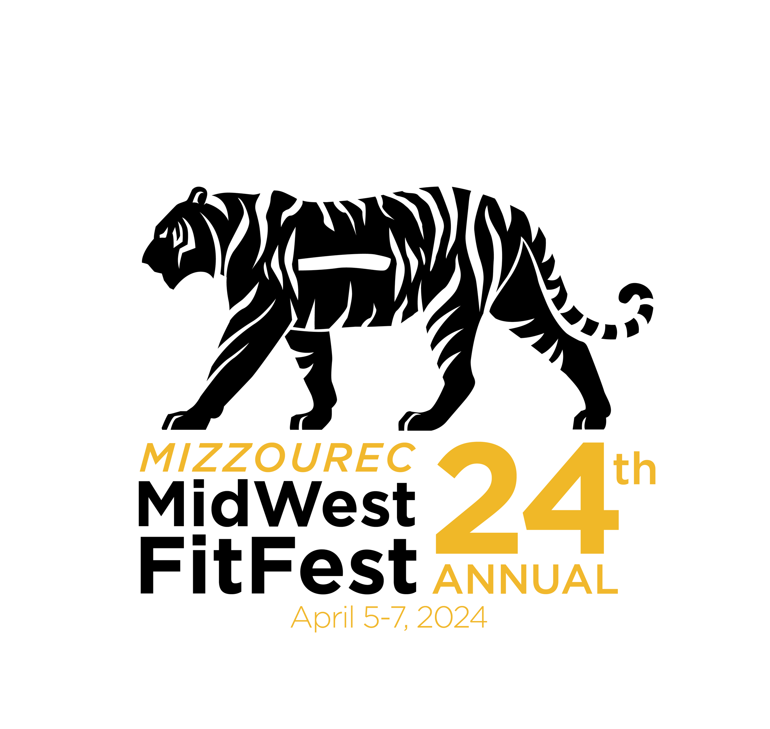
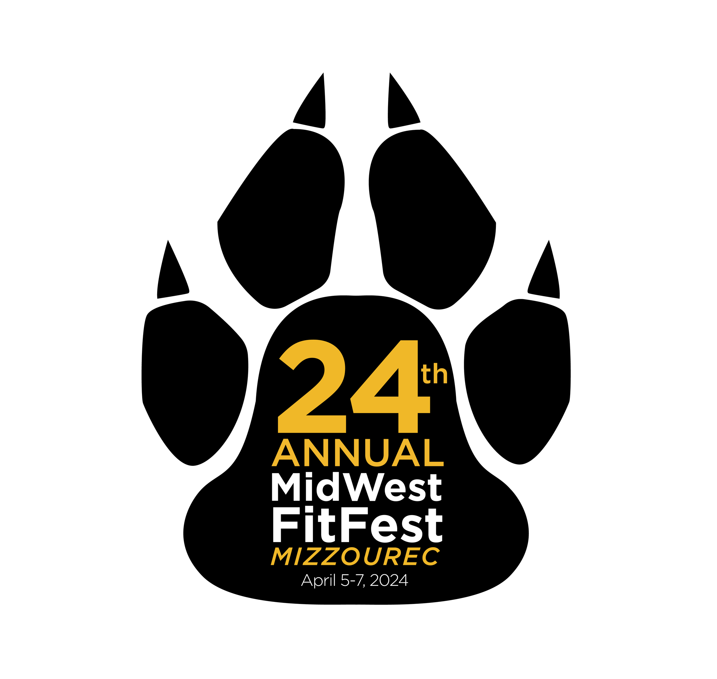
Midwest FitFest Logo Design
I designed two original logo options for Mizzou’s hosting of the 24th Annual MidWest FitFest.
Each logo had restrictions with coloring, themes and all the copy required. These logos were designed with printing in mind, specifically for event t-shirts. The classic Mizzou mascot served as the focus of my design with an emphasis on the host university over the fitness aspect, ensuring it was unique for Mizzou’s rendition of the event.
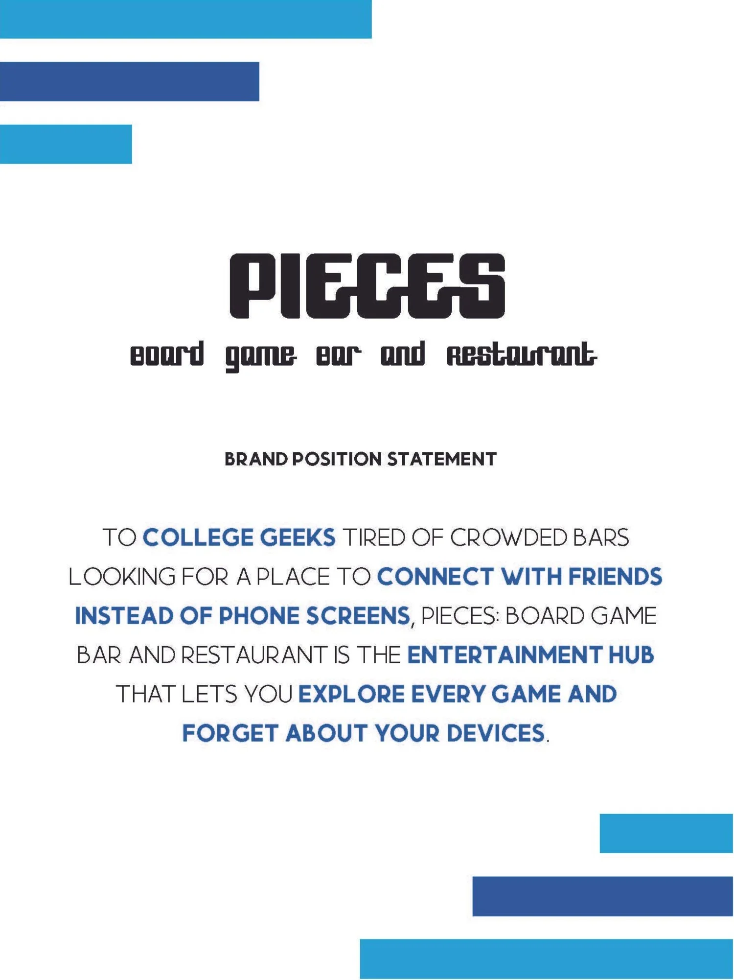
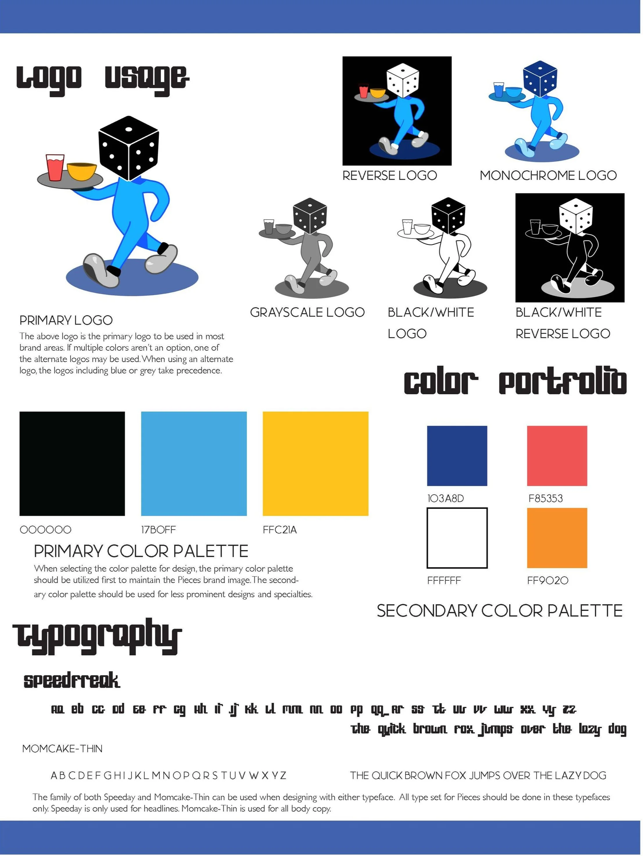
Pieces Board Game Bar & Cafe Logo Design
I solo designed a re-brand for Pieces Cafe, including logo variations, a color palette and typography. Since it was for a spunky board game bar and cafe, I wanted to keep the logo bold and playful with colors very commonly used in board games. I also felt a unique place needed a unique front-man, so I illustrated the diceman. This would serve as the Pieces signature that would be memorable and “cutesy” enough for people to want to wear it on their merchandise or put it on their laptop as a sticker.